Influence in marketing is a powerful tool that businesses use to evoke emotions, drive decisions, and create lasting impressions on consumers. One of the most crucial aspects of marketing that plays a pivotal role in influencing consumer behavior is the use of colors. Colors have the ability to communicate messages, trigger subconscious responses, and ultimately shape how individuals perceive a brand or product. Understanding the psychology of colors in marketing is vital for businesses to effectively connect with their target audience and enhance their marketing strategies.
With respect to choosing the right colors for branding and marketing materials, it’s important to consider the psychological impact that each color can have. Red, for example, is often associated with passion, energy, and urgency, making it a popular choice for brands in industries like food and retail. On the other hand, blue is commonly linked to trust, reliability, and calmness, which is why many financial institutions and tech companies use it in their branding. By strategically selecting colors that align with the intended message and target audience, businesses can leverage the psychological power of colors to influence consumer perceptions and behaviors.
Furthermore, the impact of colors in marketing goes beyond just aesthetics. Different colors can evoke specific emotions and associations that can subconsciously sway consumer decision-making. Yellow is often used to create a sense of optimism and warmth, while green is associated with health, nature, and sustainability. By utilizing colors effectively in marketing materials, businesses can create a strong brand identity, build customer trust, and establish emotional connections with their audience. The psychology of colors in marketing is a complex yet powerful tool that can have a profound impact on how consumers perceive and engage with a brand.
Key Takeaways:
- Colors can evoke specific emotions: Different colors can trigger different emotional responses in consumers, making it imperative to choose the right colors for your brand.
- Color consistency is crucial: Consistent use of colors across all marketing materials can help in brand recognition and customer trust.
- Color preferences vary by gender: Men and women may have different color preferences, so understanding your target audience is key.
- Cultural differences play a role: Colors can have different meanings in various cultures, so it’s important to consider cultural nuances in your marketing strategy.
- Call-to-action buttons benefit from certain colors: Using colors like red or green for call-to-action buttons can influence consumer behavior and increase click-through rates.
- Color combinations can affect readability: High contrasting colors for text and background can improve readability and user experience on websites and marketing materials.
- Experimentation is key: Testing different color schemes and combinations can help you determine what works best for your target audience and improve the effectiveness of your marketing efforts.
Understanding Color Theory
Basics of Color Theory
Assuming you’re new to the world of color psychology, it’s crucial to have a basic understanding of color theory. This theory explores how colors interact with each other and the impact they have on our emotions and perceptions. It is the foundation upon which all color-related decisions are made in marketing and design.
The three primary colors in color theory are red, blue, and yellow. They are considered the building blocks of all other colors, as they cannot be created by mixing other colors together. Secondary colors are made by mixing two primary colors, and tertiary colors are created by mixing primary and secondary colors.
The theory also includes the concepts of hue, saturation, and brightness. Hue refers to the actual color, saturation is the intensity of the color, and brightness is how light or dark the color is. Understanding these terms is important in utilizing colors effectively in marketing campaigns.
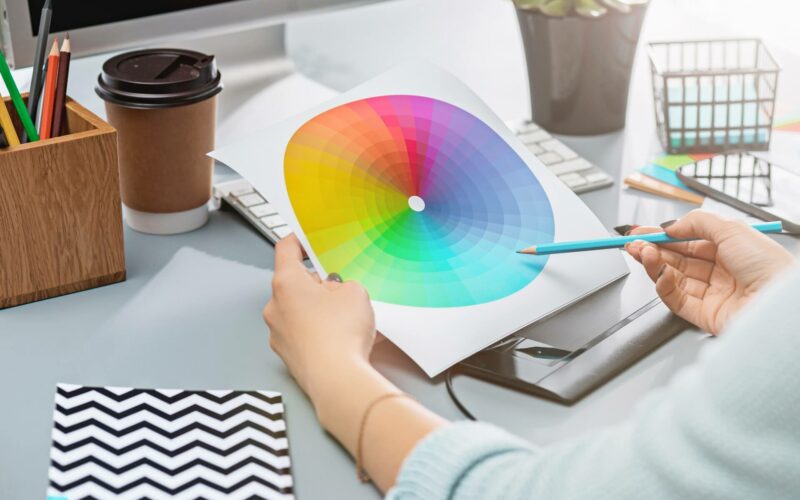
The Color Wheel and Color Harmony
An understanding of the color wheel is important in creating visually appealing marketing materials. This tool organizes colors in a way that demonstrates their relationships to each other. Complementary colors are opposite each other on the wheel and create high contrast when used together. Analogous colors are next to each other on the wheel and create a harmonious effect.
Color harmony is the theory that certain color combinations are inherently more pleasing to the eye than others. When colors are harmonious, they work together to create a unified and balanced visual experience. Brands often use color harmony to evoke specific emotions or associations in their target audience.
Understanding color harmony and the color wheel allows marketers to strategically choose colors that will resonate with their audience and convey the desired message. By deploying complementary or analogous colors effectively, brands can create visually engaging marketing materials that leave a lasting impact on consumers.
The Emotional Impact of Colors
Any marketer looking to create impactful and memorable campaigns must understand the emotional impact of colors. This aspect of color psychology researchs into how different colors can evoke specific emotions and influence consumer behavior. For example, blue is often associated with trust and stability, making it a popular choice for financial institutions.
Red, on the other hand, is known to stimulate appetite and create a sense of urgency, which is why it is often used in marketing promotions and sales. Green is commonly associated with growth and nature, making it suitable for brands focusing on eco-friendliness or organic products.
Understanding how colors can trigger emotional responses in consumers is crucial for marketers looking to create impactful branding and advertising strategies. By strategically selecting colors that align with the brand’s message and target audience, marketers can effectively communicate their brand values and influence consumer perceptions.
Color Connotations and Culture
Cultural Interpretations of Color
Keep in mind that colors can have different meanings across various cultures. In some societies, white symbolizes purity and innocence, while in others, it is associated with mourning and death. Similarly, the color red can be seen as a symbol of luck and prosperity in some cultures, but as a sign of danger in others. Understanding these cultural nuances is crucial for businesses engaged in global marketing efforts, as a color that conveys positive connotations in one country may have negative connotations in another.
It is important to consider the historical and social context when interpreting the meanings of colors in different cultures. For example, in Western cultures, blue is often associated with calmness and trust due to its connection to the sky and the sea. However, in some Eastern cultures, blue can be linked to feelings of sadness or mourning. Being aware of these cultural differences can help marketers tailor their color choices to effectively communicate with their target audience.
To avoid misunderstandings or unintentional offense, businesses should conduct thorough research on the cultural connotations of colors in the regions where they operate. By taking the time to learn about the symbolic meanings attached to different colors in diverse cultures, companies can ensure that their marketing materials resonate positively with their target demographic.
Universal Meanings of Colors
Colors have universal meanings that can transcend cultural boundaries. For example, the color yellow is commonly associated with sunshine, joy, and happiness in many cultures around the world. Similarly, green is often linked to nature, growth, and renewal, making it a universally positive color. Understanding these universal color associations can help marketers create effective and appealing branding that resonates with a global audience.
It is important to recognize that while some colors have universal meanings, their interpretations can still be influenced by cultural context. For instance, while black is often associated with mourning in Western cultures, it can represent power and elegance in some Eastern societies. By acknowledging both the universal and cultural-specific meanings of colors, businesses can craft marketing campaigns that are both visually impactful and culturally sensitive.
By leveraging the universal meanings of colors in combination with cultural considerations, marketers can develop branding strategies that effectively communicate their brand values and resonate with consumers on a deep emotional level. The strategic use of color in marketing can help businesses establish a strong brand identity and build lasting relationships with their target audience.
Case-Specific Variations in Color Perception
Interpretations of color can also vary based on specific circumstances or contexts. For example, the color red may be associated with love and passion in general, but in the context of a financial institution, it could convey warnings about debt or financial risks. Understanding these case-specific variations in color perception is crucial for crafting nuanced and targeted marketing messages that effectively communicate with consumers.
It is crucial to consider the industry and specific audience when choosing colors for marketing materials. For instance, a healthcare provider may opt for calming blues and greens to convey a sense of trust and professionalism, while a fashion brand targeting young consumers might use vibrant and energetic colors to appeal to their audience. By tailoring color choices to the unique needs and preferences of their target market, businesses can create impactful and memorable branding that resonates with consumers.
Connotations of colors can also shift over time, influenced by trends, social movements, and cultural shifts. Staying attuned to these changes and adapting color strategies accordingly can help businesses stay relevant and maintain a strong connection with their audience. By remaining flexible and responsive to evolving color perceptions, companies can ensure that their branding efforts continue to effectively engage consumers and drive brand loyalty.
Color and Brand Identity
After establishing the importance of color in marketing, it’s crucial to understand how it ties into brand identity. Your brand colors are a powerful tool in shaping how your audience perceives your business. They can evoke emotions, convey messages, and create a memorable visual identity that sets you apart from competitors. Choosing the right colors for your brand is a strategic decision that requires careful consideration.
Creating a Color Palette for Branding
Branding with color involves more than just picking a few shades that look nice together. It requires a deep understanding of color theory and psychology. Your color palette should reflect your brand’s personality, values, and target audience. Each color you choose should have a specific purpose and meaning that aligns with your brand’s messaging.
When creating a color palette for branding, consider how different colors interact with each other and the emotions they are likely to evoke. A well-thought-out color scheme can enhance brand recognition and create a cohesive visual identity across all marketing materials.
Experiment with different color combinations and gather feedback from your target audience to ensure that your chosen palette resonates with them. Do not forget, consistency is key in brand identity, so once you establish your color palette, make sure to use it consistently across all touchpoints.
Consistency and Application of Brand Colors
The consistency and application of brand colors are vital for building brand recognition and loyalty. When consumers see your brand colors consistently across various platforms and products, it helps reinforce your brand identity in their minds. Consistency in color usage also creates a sense of trust and reliability, as it shows that your brand is cohesive and well-established.
It’s important to establish brand guidelines that outline how your colors should be used in different contexts, such as digital and print materials. These guidelines should include specifications for each color in your palette, as well as rules for how they should be applied to maintain brand consistency. By adhering to these guidelines, you can ensure that your brand colors are always presented in the best possible light.
With the rise of digital marketing and the proliferation of online platforms, maintaining consistent brand colors across various channels has become more challenging. However, by investing in design tools and resources that streamline the process, you can ensure that your brand colors remain consistent and impactful, regardless of where they are displayed.
The Psychological Implications of Brand Colors
Colors have a profound psychological impact on consumer behavior and perception. Different colors can evoke specific emotions and associations that influence how consumers perceive a brand. Understanding the psychological implications of brand colors can help you leverage them effectively in your marketing strategies.
For instance, using warm colors like red and orange can create a sense of excitement and urgency, making them ideal for impulse buying. Conversely, cool colors like blue and green are often associated with trust and calmness, making them suitable for financial and healthcare brands. By leveraging the psychological effects of colors, you can create a brand experience that resonates with your target audience on a deeper level.
Color in Advertising
Color Strategies in Ad Campaigns
Strategies for using color in advertising campaigns play a crucial role in influencing consumer behavior and perception. Marketers carefully select colors based on the emotions they evoke and the brand identity they want to convey. For example, red is often used to create a sense of urgency or excitement, while blue is associated with trust and dependability. By strategically incorporating colors into ad campaigns, marketers can effectively communicate messages and drive desired actions from their target audience.
Moreover, using color psychology in advertising can help differentiate a brand from its competitors. Consistent use of specific colors can create strong brand recognition and loyalty among consumers. Whether it’s through a logo, packaging, or marketing materials, maintaining a cohesive color scheme can reinforce the brand’s image and values in the minds of consumers.
In the matter of cross-cultural marketing, understanding the significance of colors in different regions is crucial. Colors can have varying meanings and symbolism across cultures, so it’s important for marketers to research and adapt their color strategies accordingly to avoid any misinterpretation or cultural insensitivity.
The Role of Color in Attracting Attention
The use of color plays a significant role in capturing the attention of consumers in a crowded and competitive advertising landscape. Bright and contrasting colors can help advertisements stand out and grab the viewer’s eye, increasing the chances of them engaging with the content. By strategically placing vibrant colors in key areas of an ad, marketers can effectively draw attention to important information or calls to action.
With the rise of digital advertising, where consumers are constantly bombarded with visual stimuli, the strategic use of color has become more important than ever. Advertisers need to leverage color psychology to create visually appealing and attention-grabbing ads that cut through the noise and resonate with their target audience.
Emotional Appeals Through Color Choices
Color choices in advertising can evoke powerful emotions and associations in consumers. By selecting the right colors, marketers can tap into the subconscious of their audience and trigger specific feelings that influence purchasing decisions. For example, warm colors like red and orange can create a sense of excitement and urgency, while cool colors like green and blue can convey tranquility and trust.
Through the strategic use of color, advertisers can establish a strong emotional connection with consumers, making their brand more memorable and impactful. By understanding the psychological effects of colors on human behavior, marketers can create compelling and persuasive ad campaigns that resonate with their target audience on a deeper level, ultimately driving brand loyalty and sales.
Color in Retail and Merchandising
Not only do colors have a significant impact on consumer behavior in marketing, but they also play a crucial role in the retail environment. Colors are used strategically in retail and merchandising to influence customers’ perceptions, emotions, and buying decisions.
Store Design and Color Schemas
To create a visually appealing and engaging shopping experience, retailers carefully choose color schemes for their stores. Different colors evoke different emotions and can affect the overall mood of the store. For example, warm colors like red and orange are known to create a sense of urgency and encourage impulse purchases. Cool colors like blue and green, on the other hand, are calming and can promote a sense of trust and reliability.
By incorporating a harmonious color palette into store design, retailers can enhance brand perception and create a cohesive visual identity. The careful selection of colors for walls, flooring, shelving, and display fixtures can help guide customers through the store and influence their behavior, ultimately leading to increased sales and customer satisfaction.
Utilizing color psychology in store design is a powerful tool for retailers to create a memorable and immersive shopping experience. By understanding the psychological impact of colors, retailers can strategically design their stores to attract customers, drive sales, and strengthen brand loyalty.
Product Packaging and Color Influences
Store packaging and color choices play a crucial role in influencing consumer buying decisions. The color of product packaging can evoke specific emotions and perceptions in customers, influencing their likelihood to purchase a product. Brands often use color psychology to establish a connection with their target audience and convey the desired brand image.
It is crucial for retailers to consider the impact of color on product packaging carefully. The color of packaging can affect brand recognition, shelf standout, and overall product appeal. By selecting the right colors for packaging, retailers can communicate brand values, differentiate their products from competitors, and attract the attention of consumers.
Effects of Color on Buying Behavior and Decision Making
Color plays a significant role in influencing buying behavior and decision-making processes. Retailers can use color psychology to create a sense of urgency, promote specific products, and guide customers towards making a purchase. Colors can trigger emotional responses and shape consumers’ perceptions of products and brands.
This knowledge empowers retailers to strategically use colors in marketing materials, signage, and promotions to influence consumer behavior positively. By understanding the psychological impact of colors, retailers can optimize their marketing strategies, increase sales conversions, and create a more engaging shopping experience for their customers.
Color in Online Marketing
Once again, we are submerging into the fascinating world of color psychology in marketing, this time focusing on its application in the online realm. The use of colors in online marketing plays a crucial role in influencing consumer behavior, brand perception, and ultimately, conversion rates. Understanding how different colors can evoke specific emotions and responses from online visitors is key to creating a successful digital marketing strategy.
Web Design and Color Usage
Designing a website involves much more than just choosing colors that look visually appealing. Colors have the power to convey brand messaging, create visual hierarchy, and guide users through the online experience. When considering web design, it is vital to consider the contrast between background and text colors for readability, as well as the strategic use of accent colors to draw attention to important elements such as calls-to-action.
Color schemes should be carefully selected to reflect the brand’s identity and target audience preferences. For instance, a minimalist and clean design may opt for a monochromatic color palette, while a vibrant and dynamic brand might use bold and contrasting colors to stand out. Consistency in color usage across the website helps in reinforcing brand recognition and building trust with visitors.
Color psychology also plays a significant role in influencing how users perceive a website and its content. By understanding the associations that different colors carry, marketers can strategically use colors to evoke specific emotions and responses from visitors, ultimately impacting their behavior.
Color and User Experience (UX)
Color is an integral part of the user experience (UX) design, as it can affect how users navigate a website, interpret information, and make decisions. The use of color can help create visual cues and prompts that guide users towards desired actions, such as filling out a form or making a purchase.
Understanding color contrast and accessibility is also crucial in ensuring that all users, including those with visual impairments, can easily interact with the website. High contrast between text and background colors improves readability, while adhering to accessibility guidelines ensures a seamless user experience for all visitors.
When used strategically, colors can help create a sense of brand personality and create a memorable visual experience for users. Consistency in color usage, along with intuitive color choices that align with user expectations, can enhance the overall user experience and drive engagement on the website.
User experience (UX) design goes beyond aesthetics and visual appeal; it encompasses how users interact with a website and the emotions they experience throughout their journey. Colors play a critical role in shaping these experiences, influencing user perception, behavior, and ultimately, the success of online marketing efforts.
Optimizing Conversion Rates Through Color
RatesWhen considering optimizing conversion rates, color can be a powerful tool in directing user attention, creating a sense of urgency, and building trust with visitors. By strategically using colors for buttons, forms, and other call-to-action elements, marketers can guide users towards the desired conversion goal.
A/B testing different color variations can provide valuable insights into which color schemes resonate best with the target audience and drive higher conversion rates. Small tweaks in color choices can have a significant impact on user behavior and the overall effectiveness of a marketing campaign.
For instance, changing the color of a call-to-action button from blue to red may result in a noticeable increase in click-through rates, highlighting the importance of color psychology in influencing consumer decisions. By leveraging the psychological power of colors, marketers can optimize conversion rates and enhance the performance of online marketing campaigns.
For instance, using contrasting colors for call-to-action buttons can help them stand out and attract users’ attention, leading to higher click-through rates and conversions. It is vital to test different color combinations to identify the most effective ones for driving conversions and achieving marketing objectives.
Color and Accessibility in Marketing
Importance of Color Contrast and Visibility
For marketers, leveraging color psychology is crucial in conveying the right message and achieving brand recognition. However, the importance of color contrast and visibility cannot be overstated when it comes to creating accessible marketing materials. Ensuring that color combinations have enough contrast is crucial for individuals with visual impairments, low vision, or color blindness. High contrast between text and background colors can improve readability and make content easier to consume for all users.
On websites and digital platforms, using color combinations that meet accessibility standards like the Web Content Accessibility Guidelines (WCAG) can enhance user experience for a broader audience. Testing color contrast ratios and ensuring that text remains readable against different backgrounds is vital in inclusive design. By prioritizing color contrast and visibility, marketers can demonstrate their commitment to making their content accessible to everyone.
Incorporating alternative design elements such as underlines, bold text, or texture patterns can also help differentiate information for individuals who may struggle with color differentiation. By considering the diverse needs of users with varying visual abilities, marketers can create more inclusive and engaging marketing campaigns.
Inclusive Design and Color Blindness Considerations
For marketers, understanding and addressing color blindness considerations in design is key to reaching a wider audience effectively. An estimated 300 million people worldwide are color blind, which highlights the importance of creating color schemes that are easily distinguishable for all users. Avoiding relying solely on color to convey information can prevent exclusivity and ensure that messages are understood by everyone.
For instance, using color-coded graphs or charts may be challenging for individuals with color blindness. Marketers can provide additional labels, patterns, or symbols to supplement color information and improve comprehension across all audiences. By implementing these inclusive design practices, businesses can enhance the accessibility and usability of their marketing materials.
For individuals with color blindness, choosing color combinations that maintain contrast and clarity is crucial. Considering the different types of color vision deficiencies and selecting hues that are easily distinguishable can improve the overall user experience. By prioritizing inclusive design and color blindness considerations, marketers can ensure that their messaging is effectively communicated to all consumers.
Tools and Best Practices for Accessible Color Schemes
Accessible color schemes play a crucial role in making marketing materials inclusive and engaging for all users. Tools such as color contrast checkers and color blindness simulators can help marketers evaluate the accessibility of their designs. These tools provide insights into how color choices impact visibility and readability, allowing for adjustments to be made to improve overall accessibility.
When creating accessible color schemes, following best practices like using a limited color palette, avoiding color combinations that cause strain, and providing text alternatives for color-coded information can enhance the user experience. By prioritizing accessibility in color choices, marketers can ensure that their content is easily navigable and understandable for individuals with visual impairments or color vision deficiencies.
For instance, incorporating colorblind-friendly palettes or utilizing color selection tools that recommend accessible color combinations can streamline the design process and promote inclusivity. By leveraging these tools and best practices, marketers can create more accessible and user-friendly marketing materials that resonate with a diverse audience.
Psychological Effects of Color Combinations
Power of Color Pairings
Many marketers underestimate the power of color combinations in influencing consumer behavior. The way colors interact with each other can evoke different emotions and associations in the minds of customers. It is imperative to understand the psychology behind color pairings to create effective marketing campaigns that resonate with your target audience.
Pairing complementary colors can create a harmonious balance that is visually appealing and memorable. For example, combining blue and orange can create a striking contrast that draws attention, while using red and green can evoke a sense of tradition and festivity. By strategically using color pairings in your branding and advertising materials, you can influence how customers perceive your brand and products.
Experimenting with color combinations can also help you stand out in a crowded market. By combining unexpected colors or using shades that are not commonly seen together, you can create a unique visual identity that sets your brand apart from competitors. The key is to find a balance between being bold and maintaining visual coherence to ensure that your color pairings effectively communicate your brand message.
Complementary Colors and Visual Comfort
Colors play a significant role in determining the visual comfort of a design or marketing material. Complementary colors, which are located opposite each other on the color wheel, can create a visually stimulating effect that captures the audience’s attention. By using complementary colors in your designs, you can create a sense of balance and harmony that is visually appealing.
When using complementary colors, it is imperative to consider the intensity and saturation of the hues. Pairing highly saturated complementary colors can create a dynamic and energetic look, while using desaturated tones can result in a more subdued and sophisticated palette. By understanding how different color combinations affect visual comfort, you can create designs that resonate with your target audience.
Navigating the Emotional Terrain of Multicolor Compositions
Complementary colors are not the only option when creating multicolor compositions. By incorporating a range of colors that work well together, you can evoke a variety of emotions and moods in your audience. Whether you want to convey excitement, trust, or creativity, the right combination of colors can help you achieve your marketing goals.
When navigating the emotional terrain of multicolor compositions, consider the cultural associations and psychological effects of different colors. For example, using a combination of blue and white can create a sense of trust and reliability, while incorporating red and yellow can evoke feelings of energy and warmth. By understanding the nuances of color psychology, you can create multicolor compositions that resonate with your target audience on a deeper level.
Analyzing and Testing Colors in Marketing Strategies
Research Methods for Color Psychology
Color psychology plays a crucial role in marketing strategies as it helps in understanding how different colors can impact consumer behavior. Research methods for color psychology often involve conducting studies to examine the effects of various colors on emotions, perceptions, and buying decisions. Scientists and marketers use a range of techniques such as surveys, experiments, and observational studies to uncover the psychological effects of colors on individuals.
One common research method is to analyze color associations based on cultural differences. Colors can hold different meanings across various countries and regions, influencing how they are perceived by consumers. By studying these cultural nuances, marketers can tailor their color choices to resonate with specific target audiences, improving the effectiveness of their marketing campaigns.
Additionally, researchers often use advanced technologies like eye-tracking devices and neuroimaging tools to measure the neurological responses to different colors. These scientific approaches provide valuable insights into the subconscious reactions triggered by colors, helping marketers make informed decisions when selecting colors for their branding and advertising materials.
A/B Testing and Color Selection
Color A/B testing involves comparing the performance of marketing materials with different color variations to determine which color scheme resonates best with the target audience. Marketers create multiple versions of an advertisement, website, or product packaging, each featuring a different color palette. By analyzing key metrics like click-through rates, conversions, and engagement levels, they can identify the most effective color combination to maximize the impact of their marketing efforts.
One of the benefits of A/B testing is its ability to provide concrete data on the influence of colors on consumer behavior. Marketers can eliminate the guesswork and rely on data-driven insights to optimize their marketing strategies. This iterative testing process allows companies to continuously refine their color choices based on real-time feedback, leading to improved brand experiences and higher conversion rates.
It is crucial for marketers to carefully plan and execute A/B tests to ensure reliable results. Factors such as sample size, testing duration, and control variables must be considered to obtain accurate conclusions about the impact of colors on consumer preferences. By following best practices in A/B testing methodology, marketers can harness the power of colors to enhance their marketing effectiveness and drive business growth.
Evolution of Preferences and Trends in Color
Color preferences evolve over time, influenced by cultural shifts, design trends, and changing consumer tastes. Marketers need to stay attuned to these evolving preferences to ensure their branding remains relevant and appealing to target audiences. Tracking industry trends and consumer behavior can help marketers anticipate shifts in color preferences and adjust their marketing strategies accordingly.
As technology advances and design aesthetics evolve, new color trends emerge in the marketing landscape. Brands often leverage these trends to differentiate themselves in the market and capture consumer attention. By experimenting with innovative color palettes and staying ahead of design trends, companies can position themselves as modern and forward-thinking, resonating with contemporary consumers.
By understanding the evolution of color preferences and trends, marketers can adapt their color strategies to remain competitive and capture the attention of their target audience. Incorporating popular colors and design elements into marketing materials can enhance brand perception and establish a strong visual identity that aligns with current consumer preferences.
Testing:
When conducting color tests, it is crucial to isolate variables and focus on one color element at a time to accurately measure its impact on consumer behavior. Marketers should also consider the cultural background and psychographic characteristics of their target audience when selecting colors for marketing materials. By conducting thorough testing and analysis, marketers can unlock the full potential of colors in influencing consumer perceptions and driving brand success.
The Future of Color Psychology in Marketing
Innovations in Color Use
Any discussion on the future of color psychology in marketing must include innovations in color use. As technology continues to advance, marketers are exploring new ways to integrate colors into their strategies. One exciting trend is the use of interactive color experiences, where customers can customize colors in real-time to tailor their shopping experience. This level of personalization not only enhances user engagement but also creates a sense of ownership and connection with the brand.
Another innovative approach is the use of color-changing materials in product packaging. Companies are experimenting with materials that shift colors based on temperature or light, creating a dynamic and visually appealing display on the shelves. This not only attracts attention but also conveys a sense of innovation and modernity, helping brands stand out in a competitive market.
The future also holds potential for the integration of colors in augmented reality (AR) and virtual reality (VR) experiences. By immersing consumers in a virtual world where colors can be manipulated in real-time, brands can create unforgettable sensory experiences that leave a lasting impact on customers.
Predicting Color Trends Through Consumer Behavior
An important aspect of the future of color psychology in marketing is predicting color trends through consumer behavior. By analyzing data on consumer preferences, shopping habits, and cultural influences, marketers can anticipate which colors will resonate with their target audience in the future. This predictive analysis allows brands to stay ahead of the curve and adjust their color schemes accordingly to maintain relevance and appeal.
This proactive approach enables brands to tap into the collective consciousness of their target market and align their color strategies with emerging trends. By understanding the psychology behind color preferences and the emotional responses they evoke, companies can create powerful marketing campaigns that resonate with consumers on a deep, subconscious level.
By combining the science of color psychology with cutting-edge analytics and consumer insights, brands can develop a data-driven approach to color selection that not only reflects current trends but also anticipates future shifts in consumer behavior. This forward-thinking strategy gives brands a competitive edge in a fast-paced and ever-evolving market.
Integrating Color Psychology with Other Marketing Advances
This is an exciting time for marketers as they explore the possibilities of integrating color psychology with other marketing advances. By incorporating color psychology principles into artificial intelligence (AI) algorithms, brands can customize color recommendations based on individual consumer profiles and behavior patterns. This level of personalization enhances the overall customer experience and increases the likelihood of conversion.
Psychology and neuromarketing studies have shown that certain colors can trigger specific emotions and behaviors in consumers. By leveraging this knowledge and integrating color psychology with emerging technologies such as chatbots and voice assistants, brands can create more compelling and persuasive marketing messages that drive engagement and loyalty.
Color also plays a vital role in multi-channel marketing strategies, where consistency across different platforms is crucial for brand recognition. By aligning color palettes with brand identity and values, companies can create a unified and immersive brand experience that resonates with consumers across various touchpoints, ultimately leading to increased brand loyalty and advocacy.
Final Words
The psychology of colors in marketing is a powerful tool that can significantly impact consumer behavior and perceptions. By understanding the emotional responses and cultural associations that different colors evoke, marketers can strategically use colors to influence purchasing decisions, brand recognition, and overall customer experience. It is crucial for businesses to carefully consider the colors they use in their branding and marketing materials to effectively communicate their message and connect with their target audience.
Color psychology goes beyond aesthetics; it taps into the subconscious mind, triggering specific emotions and influencing how individuals perceive a brand or product. Whether it’s creating a sense of trust with blue, stimulating appetite with red, or promoting creativity with yellow, each color has a unique impact that marketers can leverage to achieve their marketing objectives. By incorporating color psychology into their marketing strategies, businesses can create a more compelling and memorable brand presence that resonates with consumers on a deeper level.
As technology continues to evolve and consumer preferences shift, mastering the art of color psychology in marketing remains relevant and crucial for businesses looking to stand out in a competitive marketplace. By investing time and resources in understanding the intricate relationship between colors and consumer behavior, companies can gain a competitive edge and build a strong brand identity that resonates with their target audience. Ultimately, the psychology of colors in marketing is a valuable tool that can help businesses create meaningful connections, drive sales, and foster long-term relationships with their customers.
FAQ
Q: What is the importance of colors in marketing?
A: Colors play a crucial role in marketing as they have the power to evoke emotions, convey messages, and influence consumer behavior.
Q: How do colors affect consumer perception?
A: Colors can impact how consumers perceive a brand or product, influencing their attitudes, feelings, and buying decisions.
Q: What are some common associations with different colors in marketing?
A: Colors have cultural and psychological associations that can influence consumer perceptions, such as red for energy, blue for trust, and green for nature.
Q: How can businesses choose the right colors for their branding?
A: Businesses should consider their target audience, brand identity, and the emotions they want to evoke when choosing colors for their branding and marketing materials.
Q: Can color choices impact brand recognition and memorability?
A: Yes, selecting consistent colors for branding can increase brand recognition by up to 80% and improve brand memorability among consumers.
Q: Are there cultural differences in color perceptions that businesses should consider?
A: Yes, colors can have different meanings and associations in different cultures, so businesses should be mindful of cultural nuances when using colors in their marketing strategies.
Q: How can businesses test the effectiveness of colors in their marketing efforts?
A: Businesses can conduct A/B testing, use focus groups, or analyze consumer feedback to evaluate how different colors impact consumer perceptions and behaviors in their marketing campaigns.
![10 Must-Have AI Tools for Startups & Small Businesses [2026]](https://smartgeekguide.com/wp-content/uploads/2025/10/top-10-ai-tools-for-startups-2026-xmg-360x240.jpg)